
BeFunky: Brand & Product Design
BeFunky is an online creative platform offering photo editing, graphic design, and collage-making tools. Designed to make creative work accessible to a wide range of users, it serves everyone from casual creators and small business owners to marketers and more experienced designers. During my seven years on the in-house design team — including 3+ years as the sole designer — I worked across brand, web, product, and marketing, helping shape how the platform looked and felt as its tools and experiences evolved.
Challenge
BeFunky's existing identity was bright, playful, and approachable, but its visual language had become dated and inconsistent across the website and product. As the platform evolved, the brand needed a more cohesive and flexible system that could support a growing range of creative tools, features, and content without losing its personality.
Approach
Working alongside the product and engineering teams, I helped evolve BeFunky's visual identity and extend it across web, product, and marketing experiences.
Rather than starting from scratch, we built on recognizable elements of the existing brand, refining and expanding its visual language through color, abstract shapes, patterns, imagery, and illustration. My work included visual exploration, landing-page design, custom iconography and illustrations, reusable page treatments, and selected product interfaces.
The result was a more cohesive and expressive experience that could adapt across a wide range of applications.
Client
BeFunky
Role
Senior Brand & Product Designer
Deliverables
Brand Refresh, Visual Direction, Web Design, Product UI, Iconography, Illustration, Marketing & Content
01. Web Refresh
The refresh wasn't about replacing BeFunky's personality, but strengthening it. Bright colors, dot patterns, and abstract shapes were already part of the brand's visual language. We built on those familiar elements, giving them a more prominent and intentional role while exploring new color and imagery directions.
The result was a more cohesive, expressive identity that felt recognizably BeFunky while giving the website and product room to evolve.
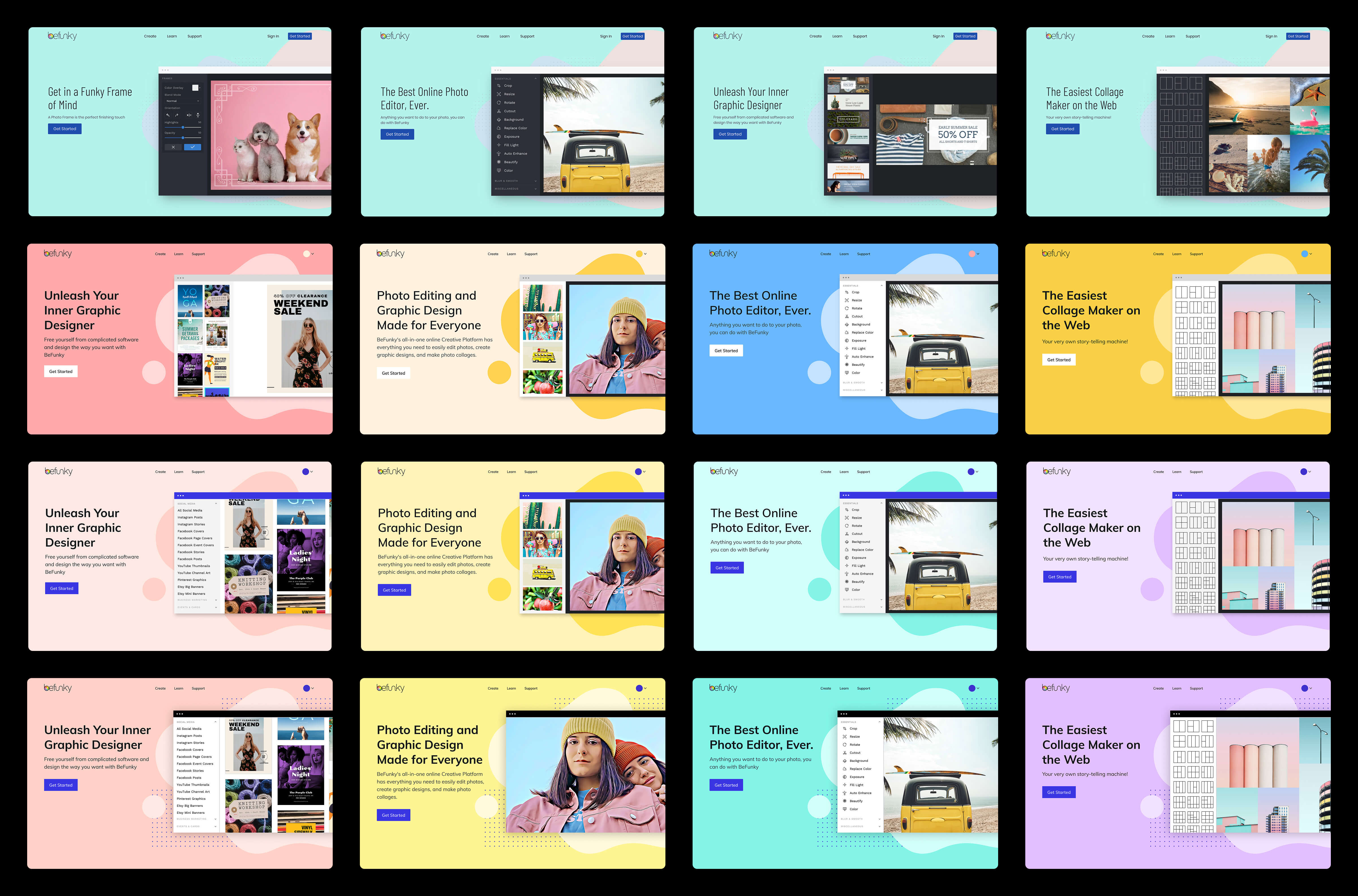
The original BeFunky identity, explorations, and the final direction.
Visual Language
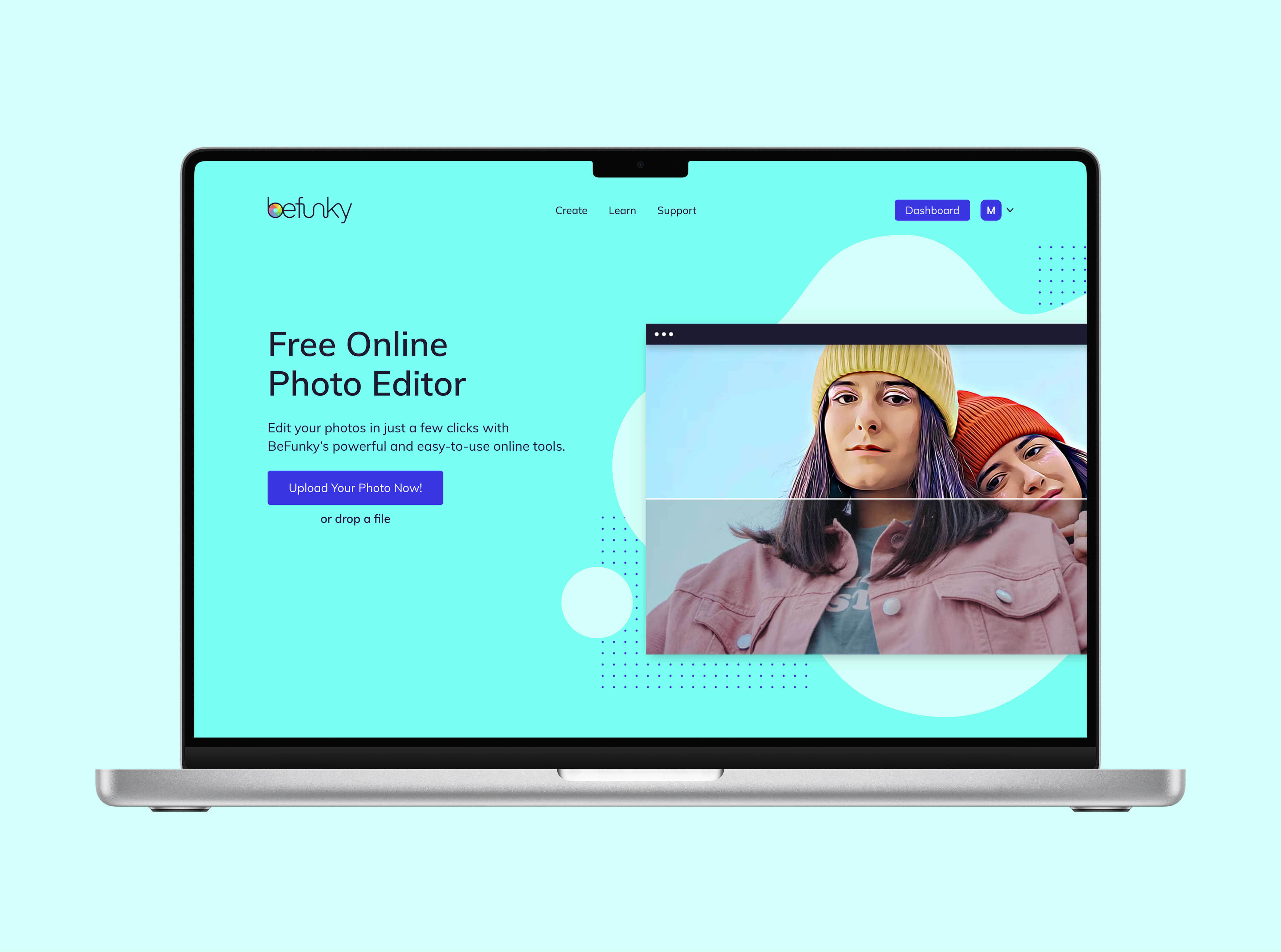
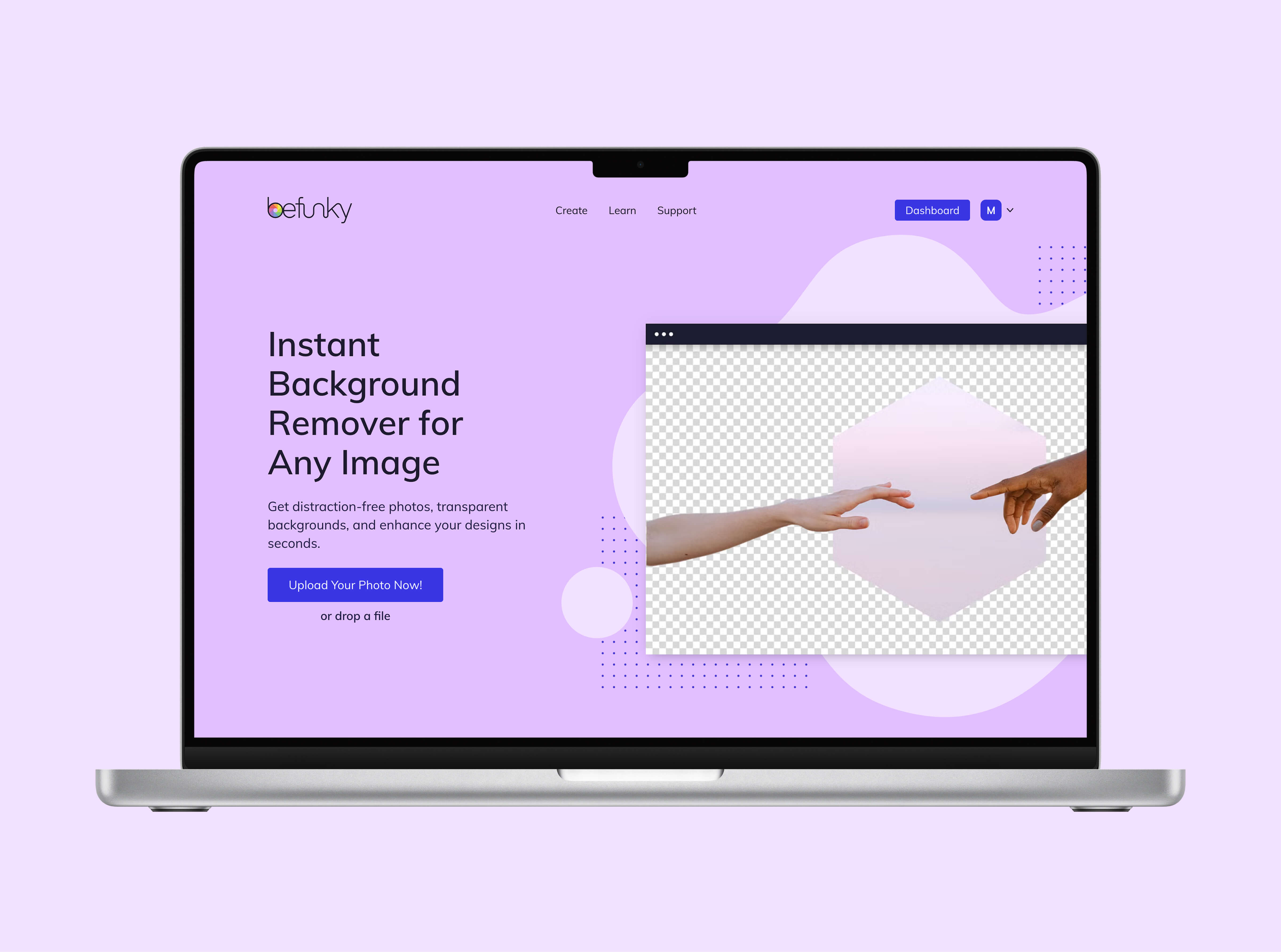
I explored new color directions alongside the landing-page designs, developing a palette that expanded BeFunky's playful identity. After presenting the explorations to leadership, a final direction was selected, combining the new accent colors with Slate Blue and Jet Black from the product UI.
Abstract shapes, dot patterns, rounded forms, and expressive imagery brought consistency across the experience while giving individual tools and features room for their own character.



Web Applications
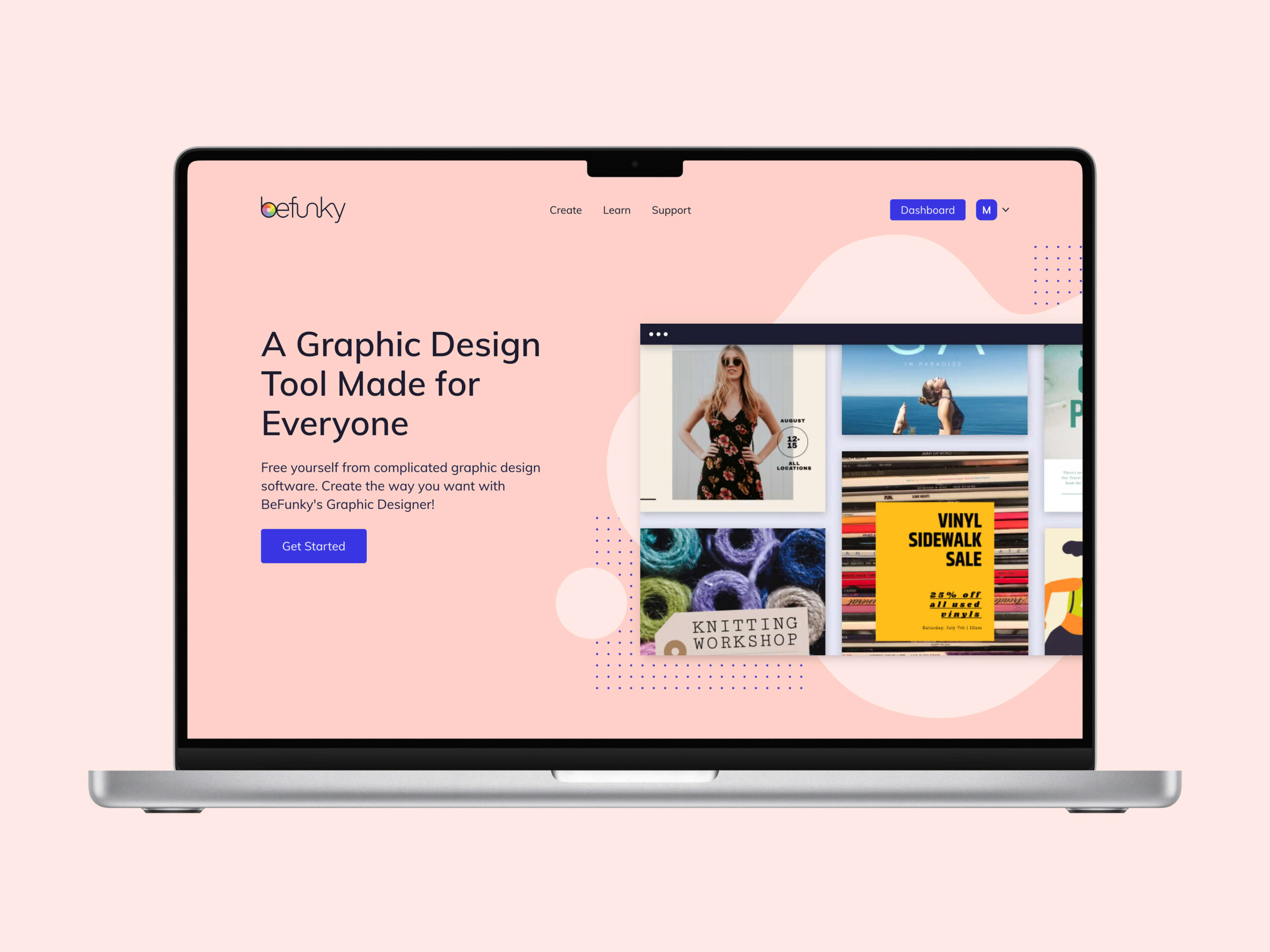
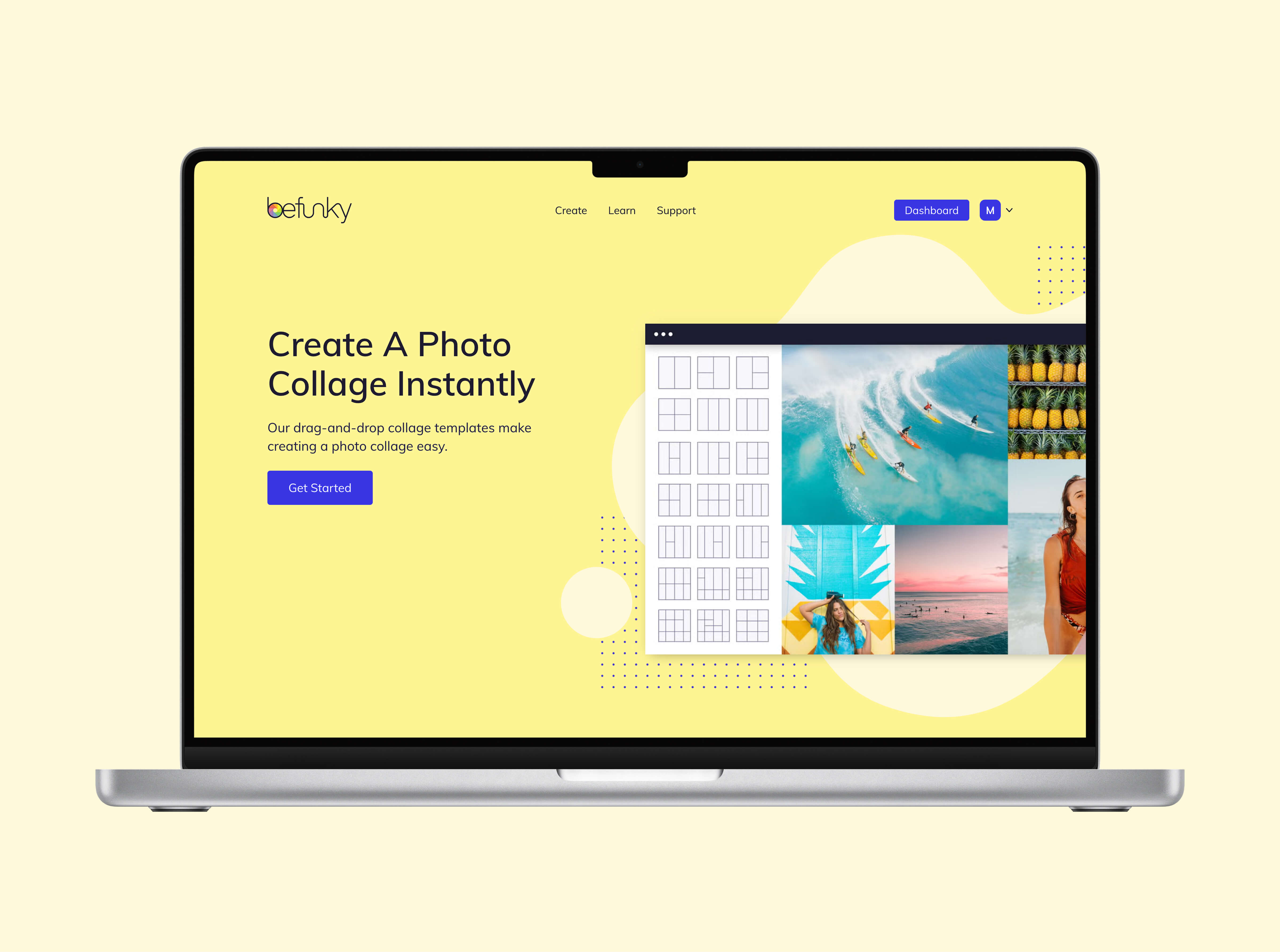
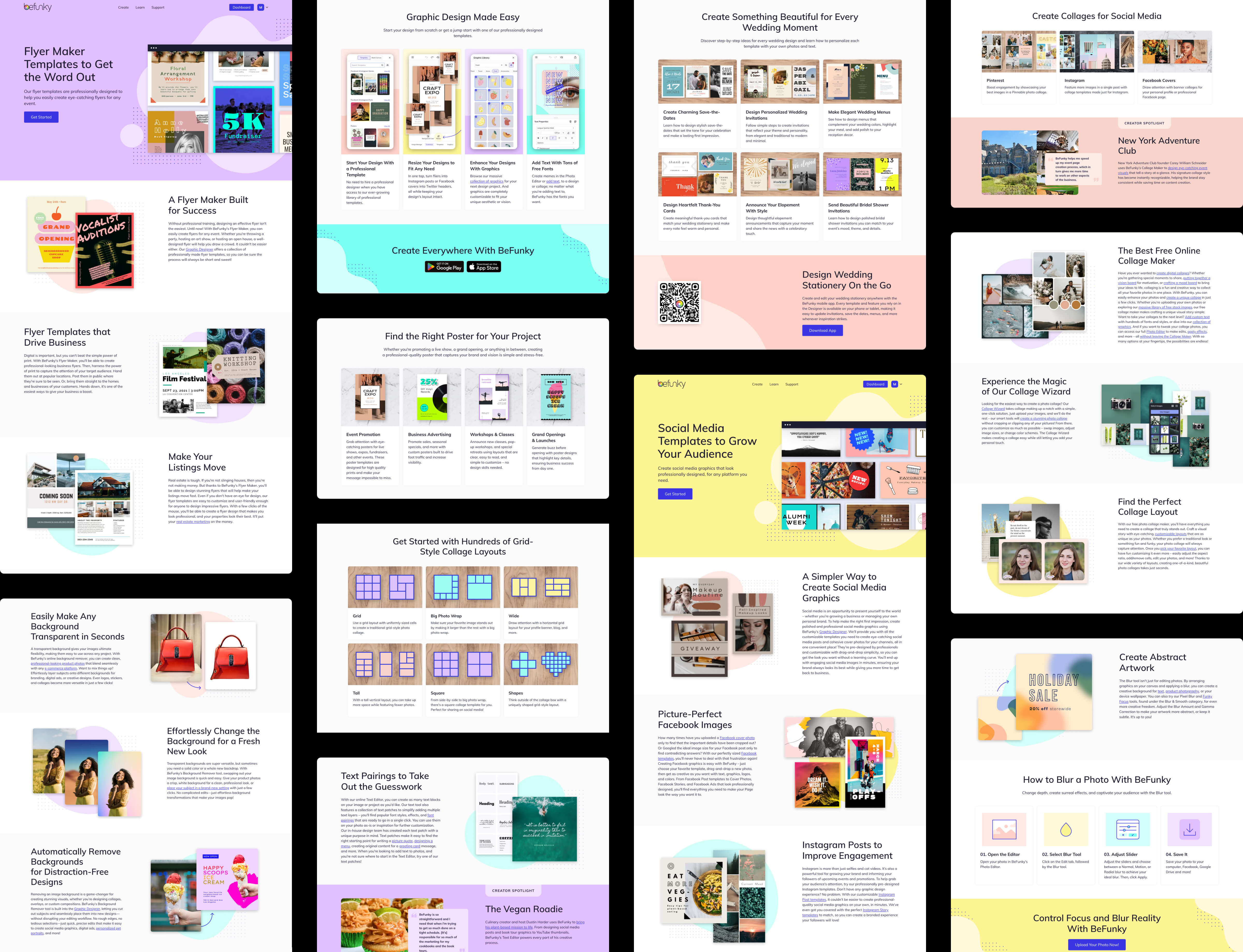
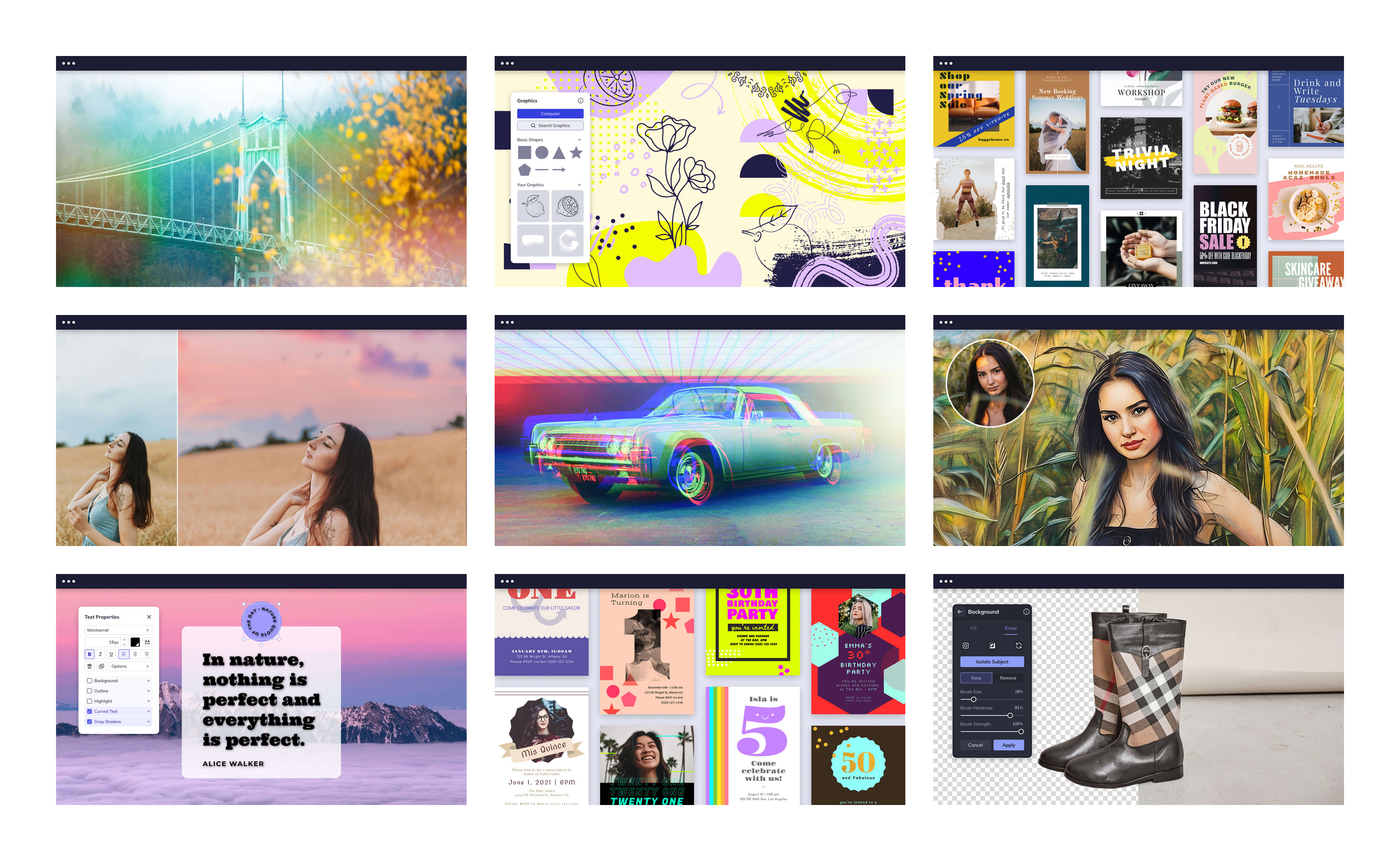
I developed visual treatments for landing-page heroes, supporting imagery, and reusable content sections across more than 60 pages. The challenge was maintaining a recognizable design language while giving individual tools and use cases room to feel distinct.
These examples show how the system extended beyond the initial hero designs into a wide range of page layouts, image treatments, instructional content, and promotional sections.
Original Befunky landing pages and slices (top); Brand refresh landing pages and slices (bottom)

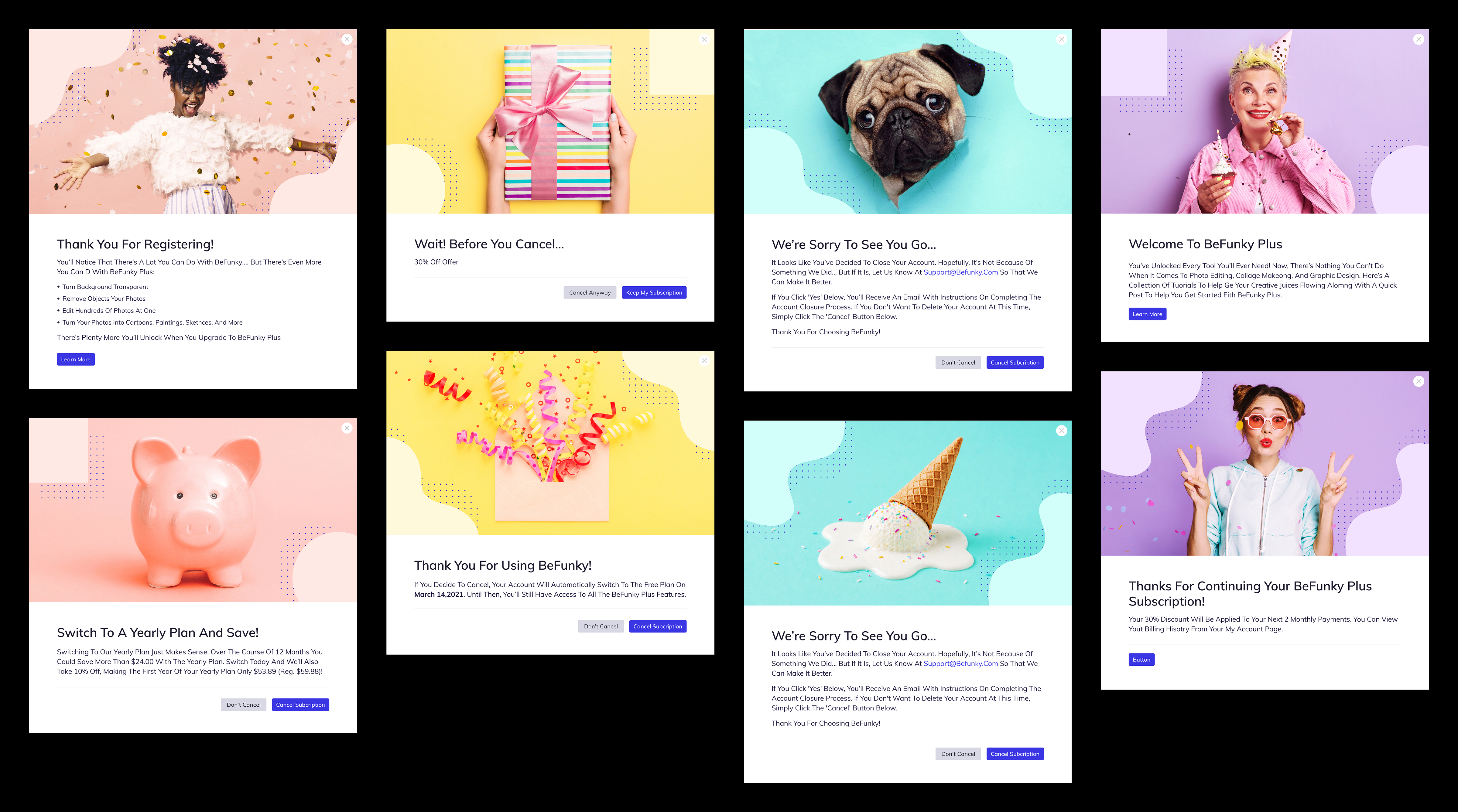
Account & Subscription
The visual language also extended into account and subscription touchpoints, bringing the same approachable character to registration, cancellation, and other functional states.
02. Iconography
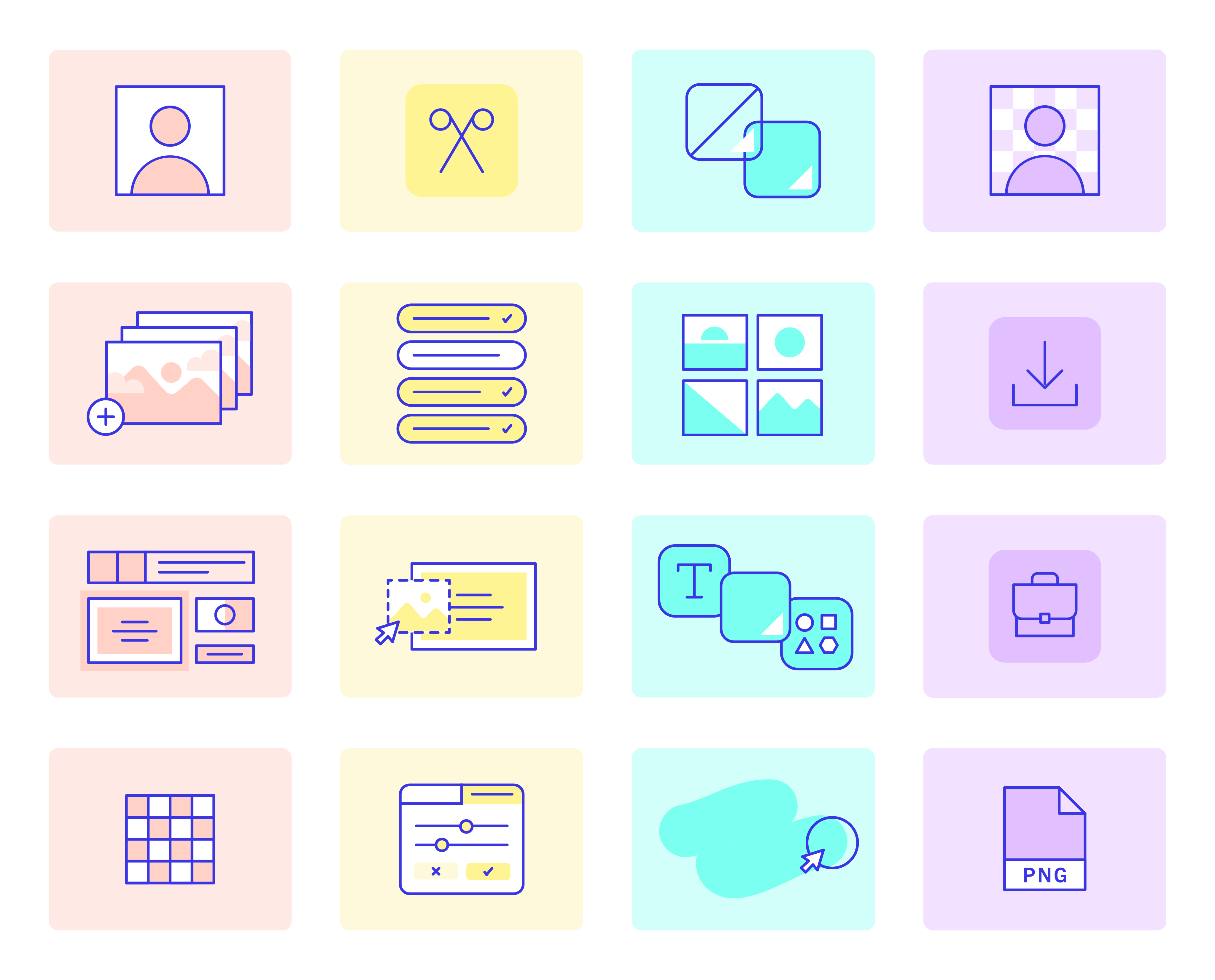
As part of the broader visual refresh, I designed a family of more than 250 custom icons to bring consistency and personality to BeFunky's creative tools and interfaces.
The system needed to accommodate a wide range of functions while remaining recognizable, intuitive, and cohesive across the platform.
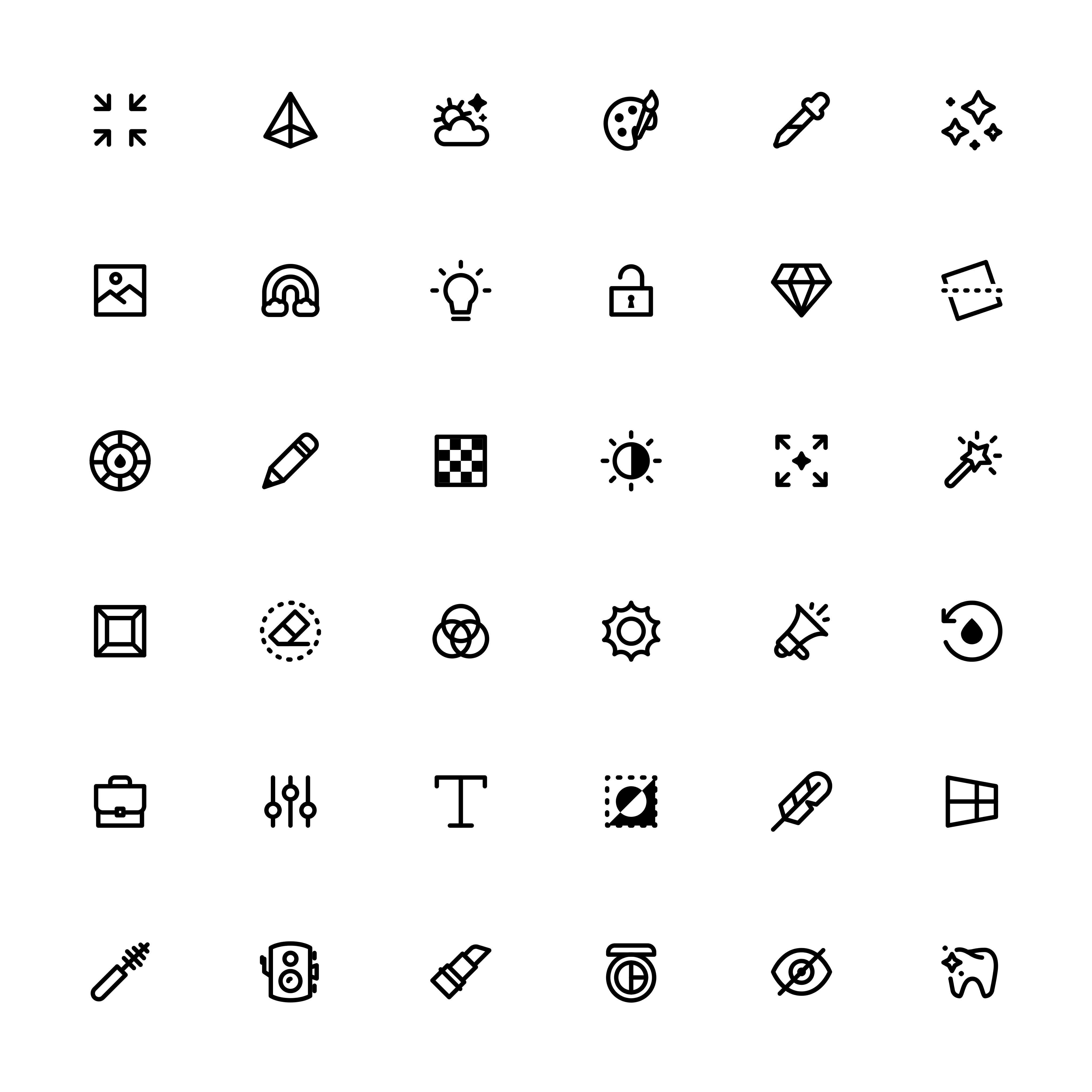
Selected icons from the 250+ custom icon family.
Icons in Use
The icon family extended throughout the product, from primary navigation and tool menus to layer controls, editing options, and supporting interface elements.
Each icon needed to communicate its function clearly at a small scale while feeling like part of the same visual family.
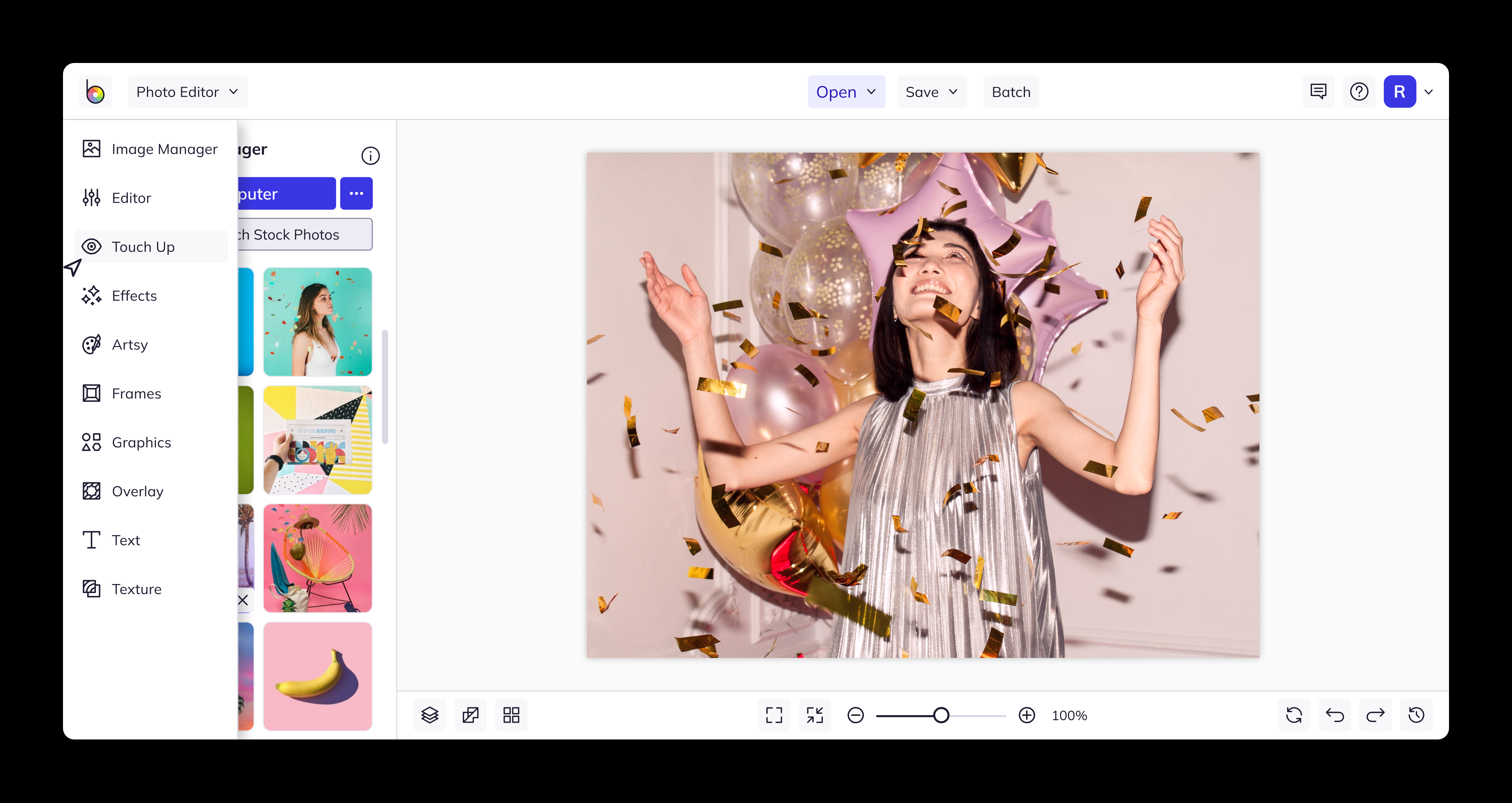
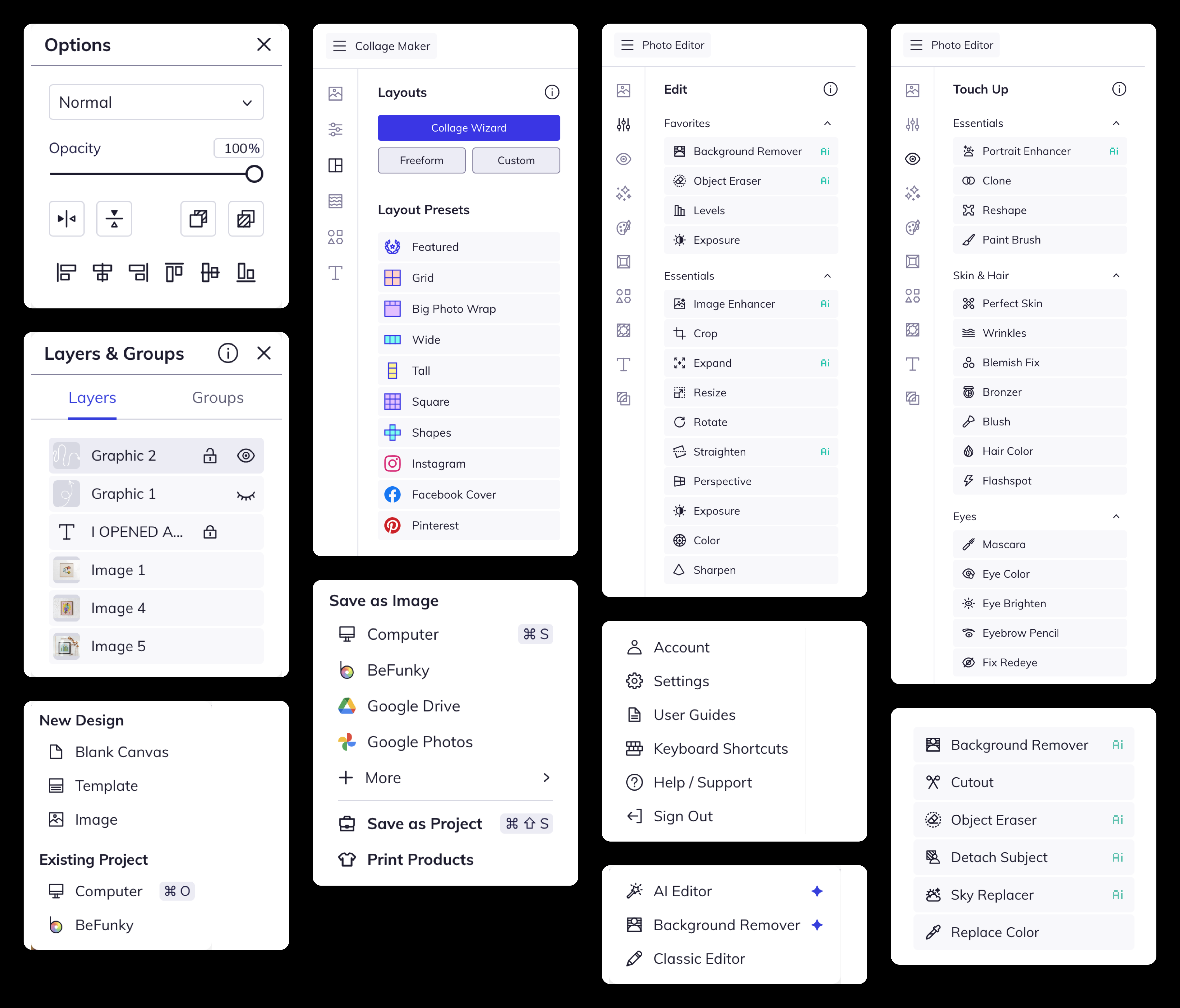
Custom iconography applied throughout BeFunky's editing tools and interface.
Process & Construction
The icon family was designed on a 28 × 28 px grid with a 2 px rounded stroke, using fills selectively when they improved clarity or emphasis.
I used the construction grid to keep proportions and stroke relationships consistent, but treated it as a guide rather than a constraint. Some icons intentionally extend beyond it to maintain equal optical weight and visual balance across the set.
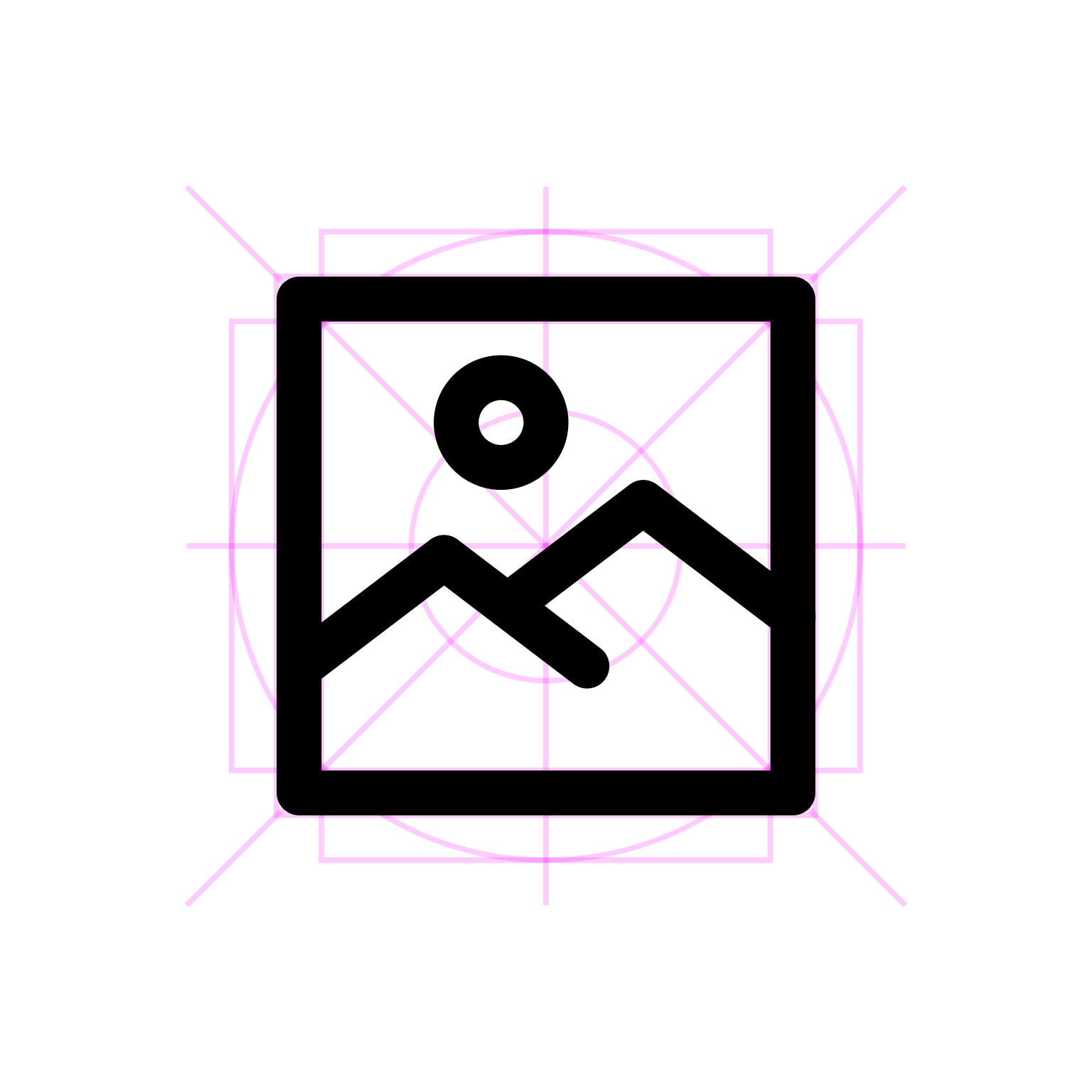
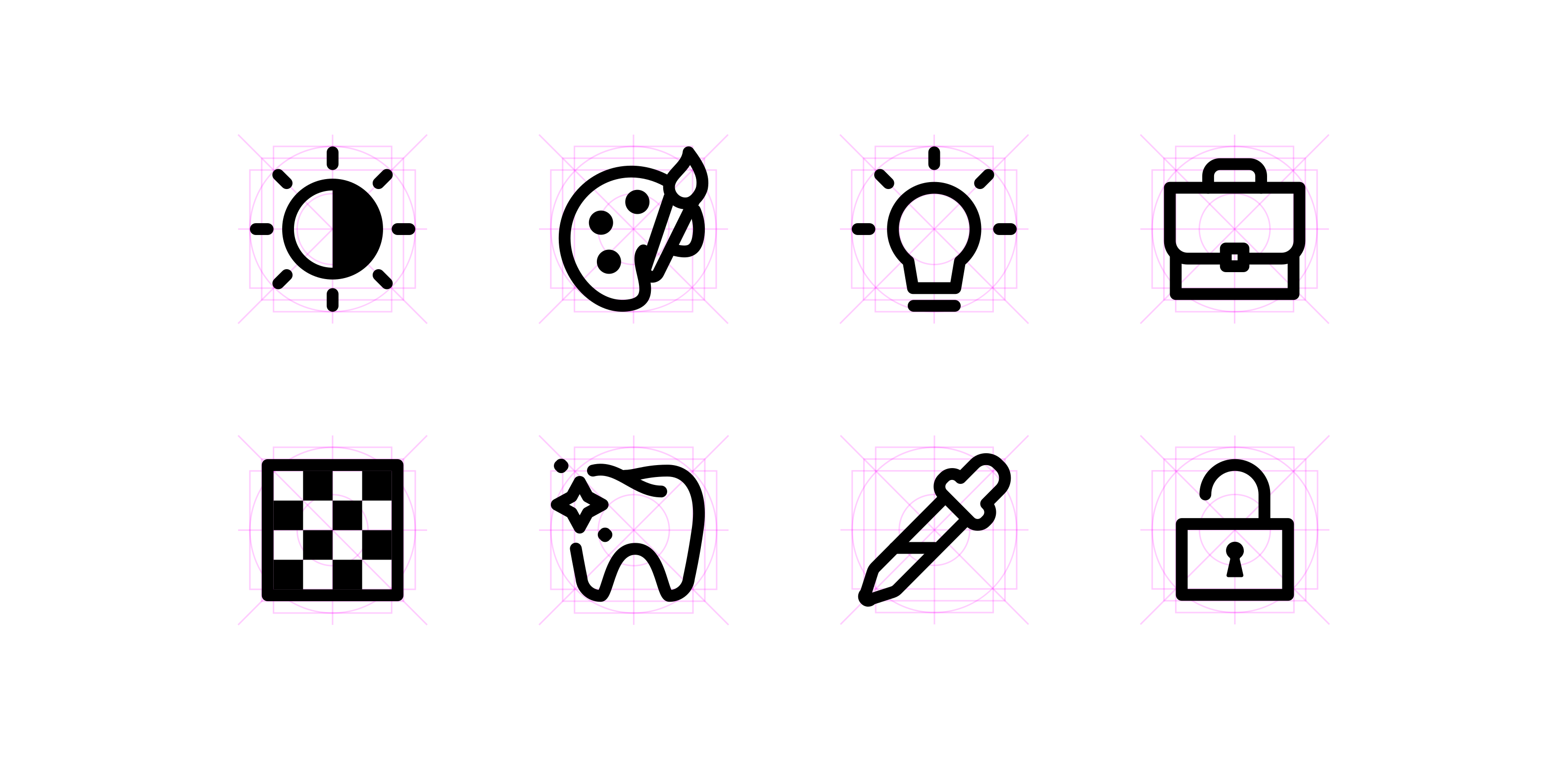
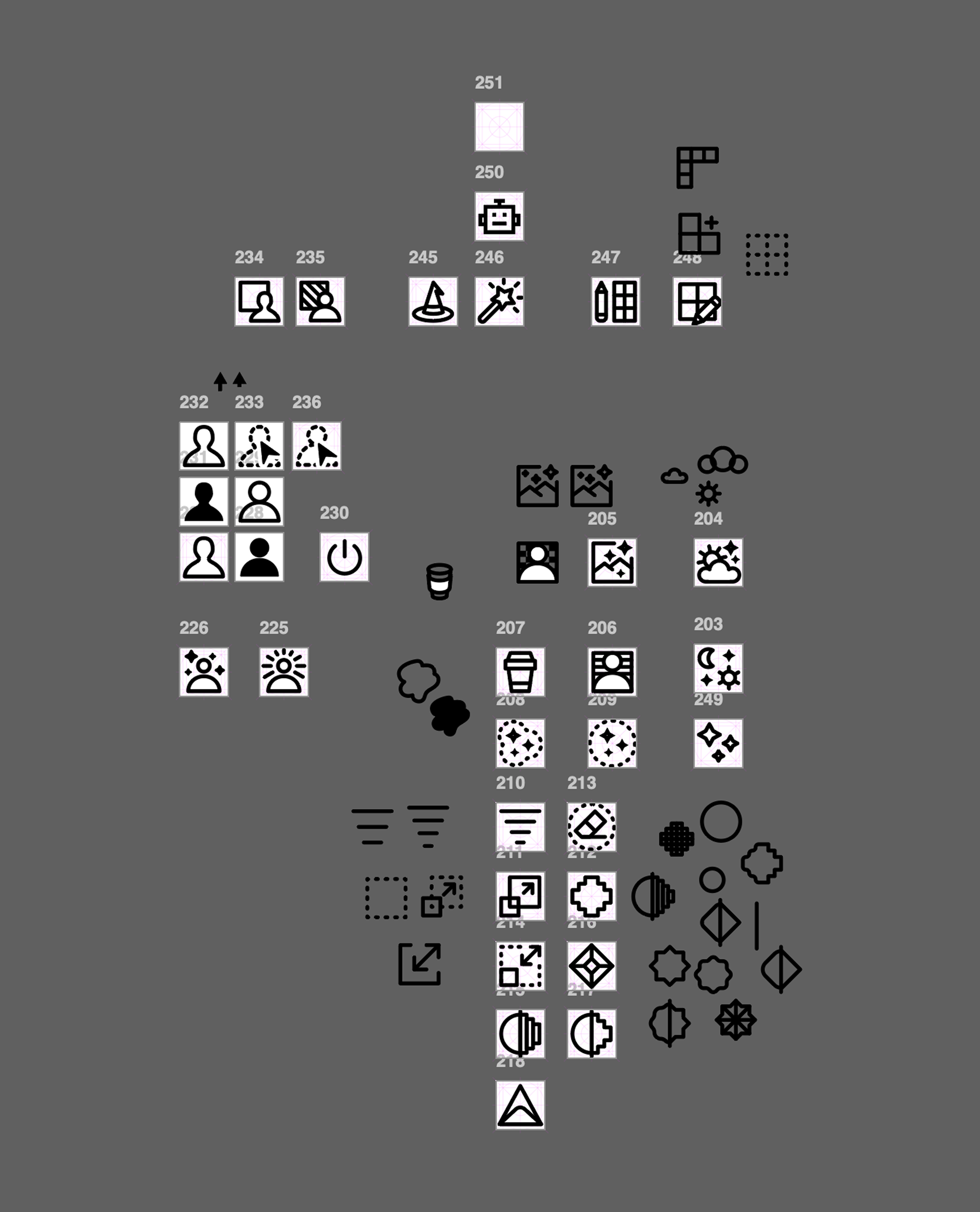

Icon explorations and construction grids showing the shared geometry and optical adjustments behind the family.
03. Illustrations
As part of the visual refresh, I developed a family of illustrations that brought BeFunky's playful character into functional product experiences.
Using the brand's accent colors, rounded forms, and fine blue outlines, the illustrations created a consistent visual language for navigation, empty states, error messages, and instructional content. They helped make everyday interactions feel more approachable without compromising clarity.
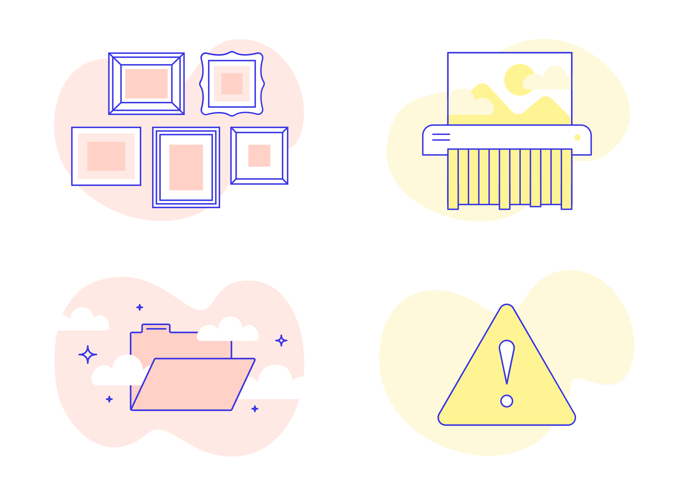
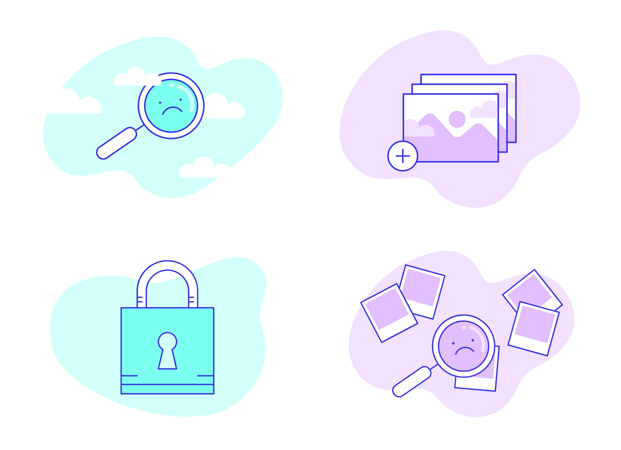
Selected illustrations developed for product features, empty states, and supporting content.
Illustrations in Use
The illustration system extended across the website and product, from navigation menus and feature pages to account states and mobile experiences.
Some illustrations introduced tools or guided users through a task, while others brought personality to moments when content was missing or an action couldn't be completed.
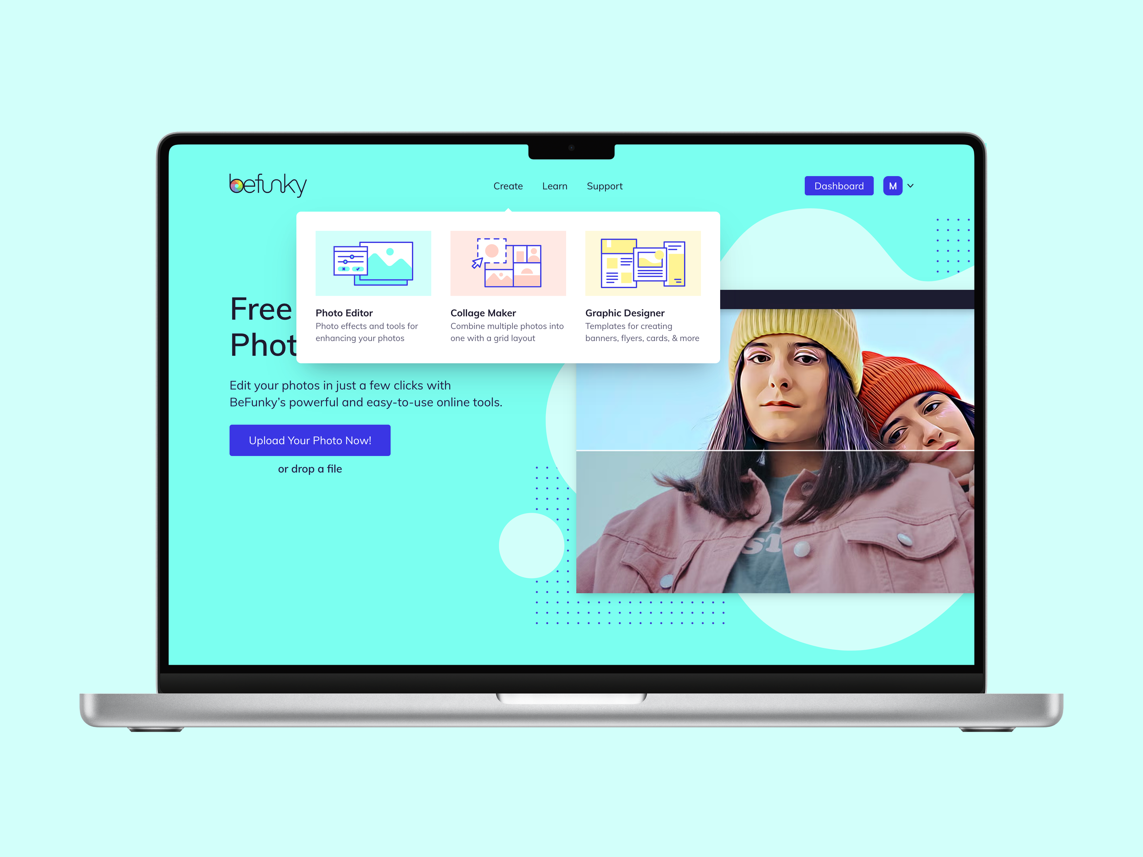


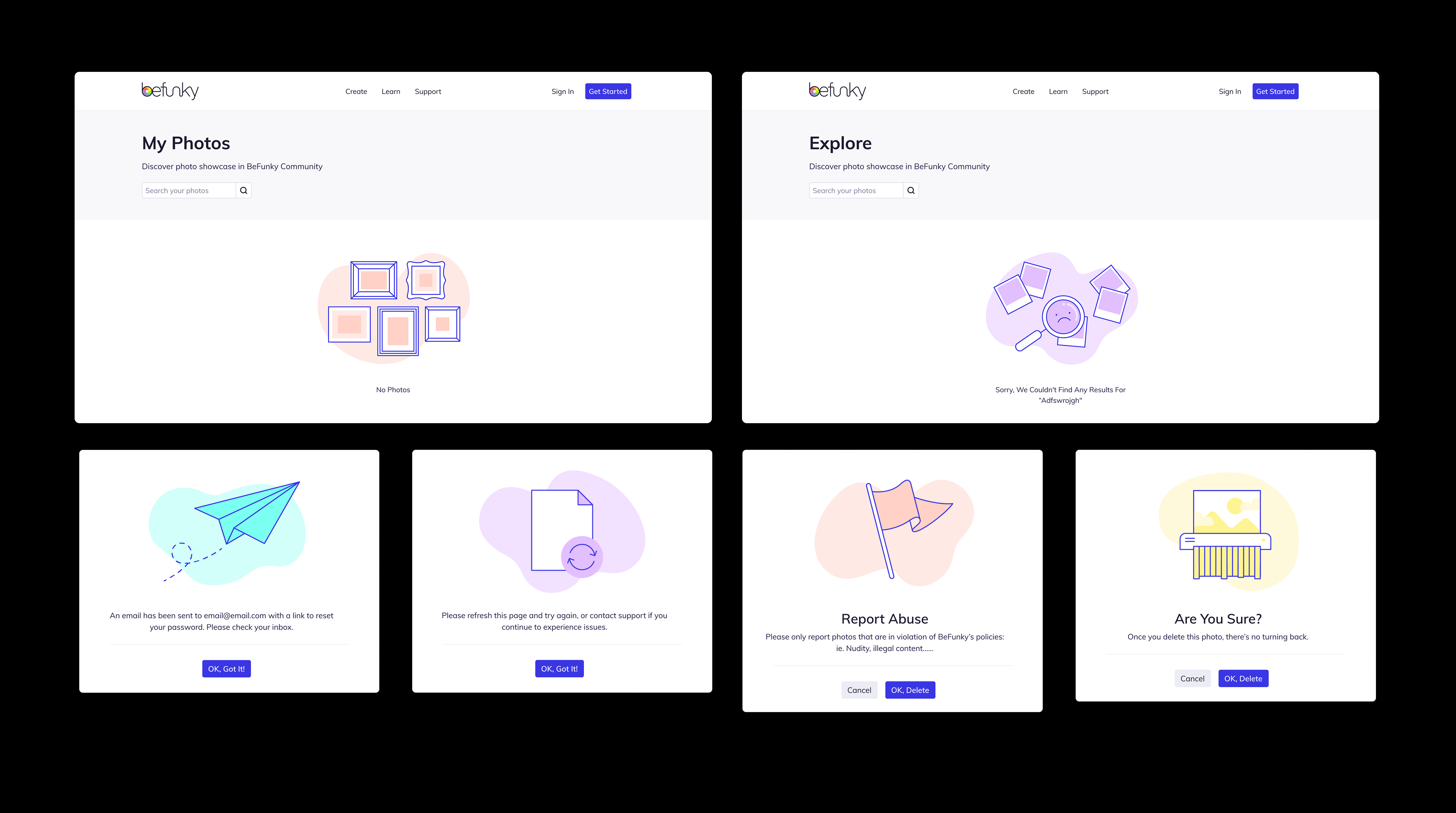
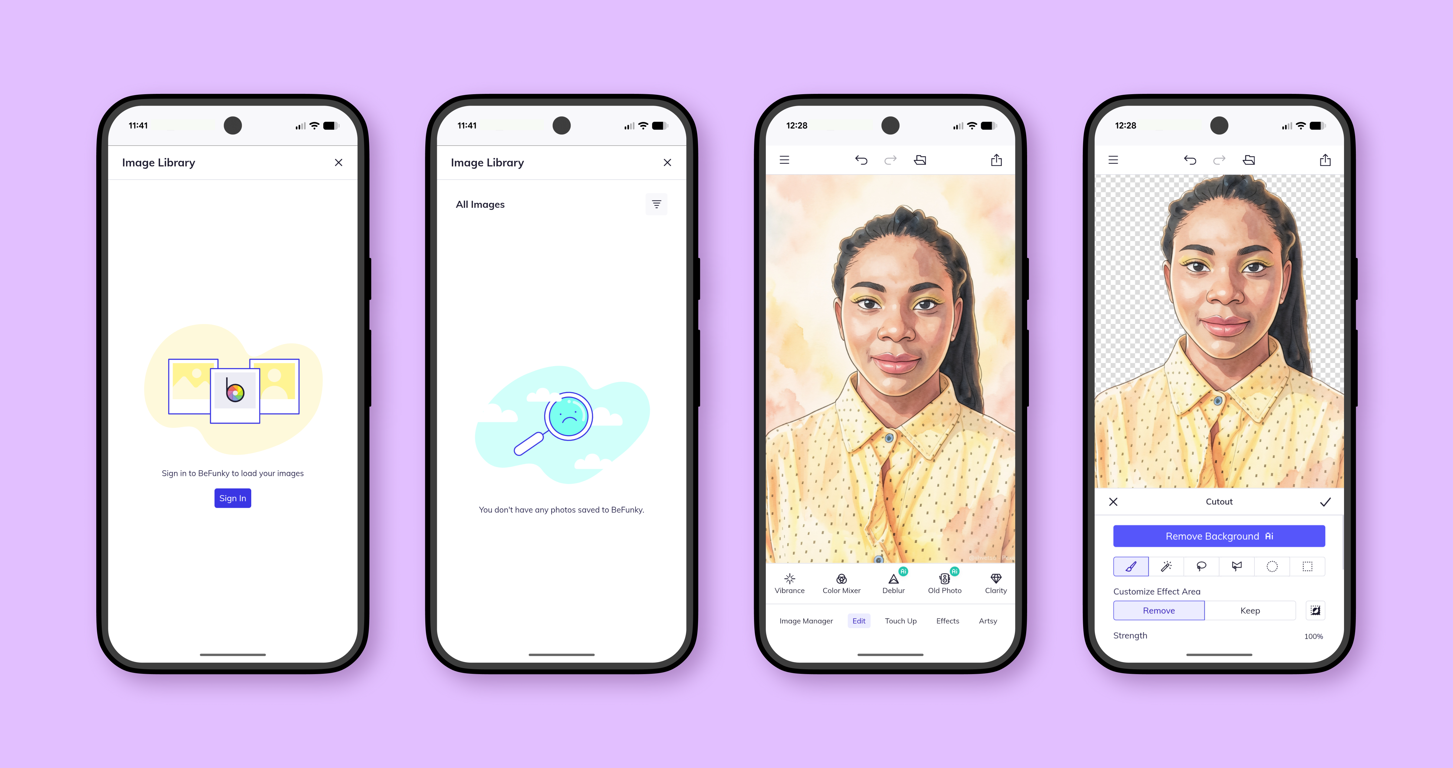
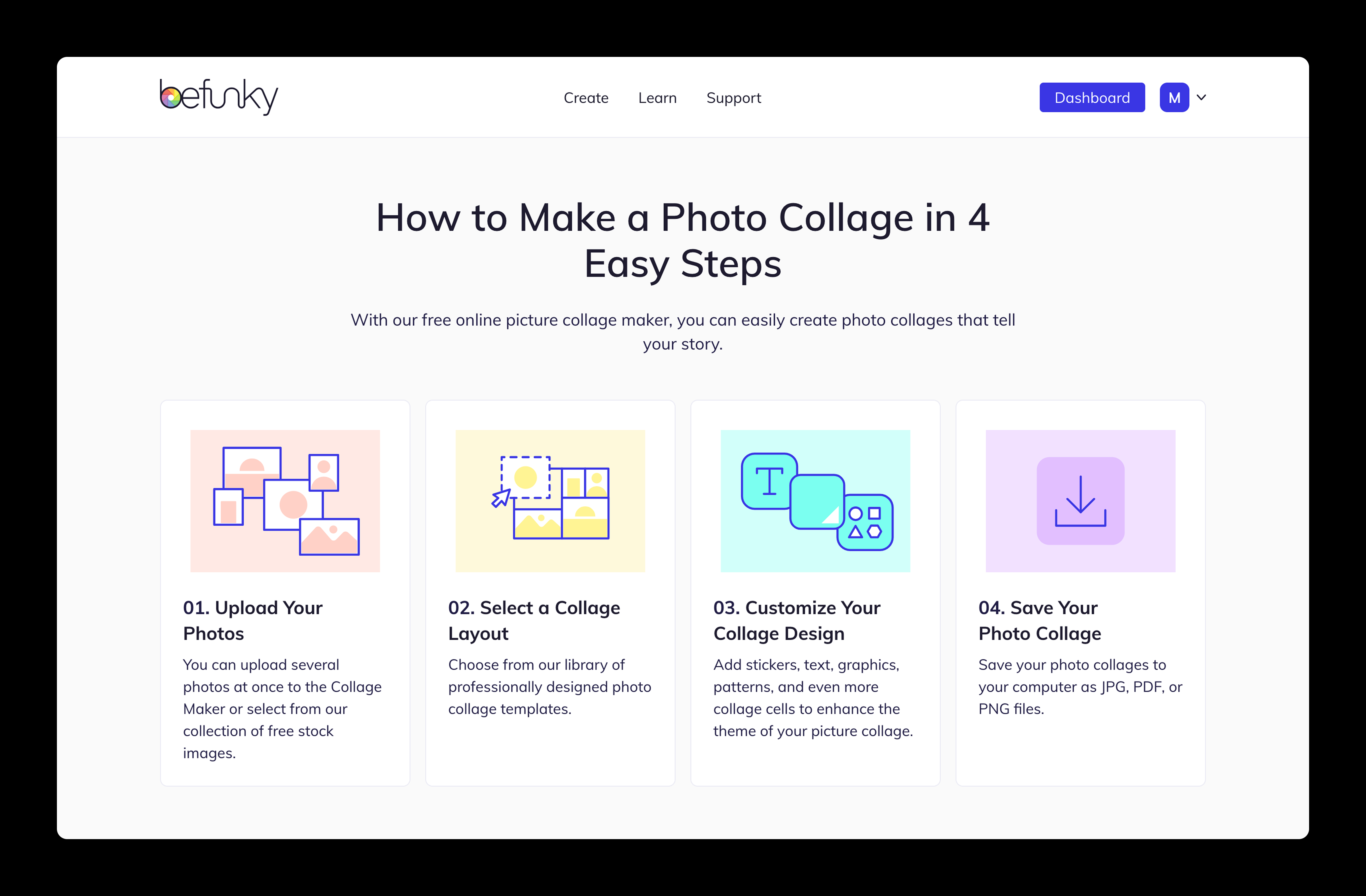
Illustrations in context across web and mobile experiences.
Process & Exploration
I explored different compositions, visual metaphors, and color treatments to communicate each concept clearly at small sizes. The shared palette, outlines, and abstract background shapes helped create a cohesive family across a wide range of subjects.
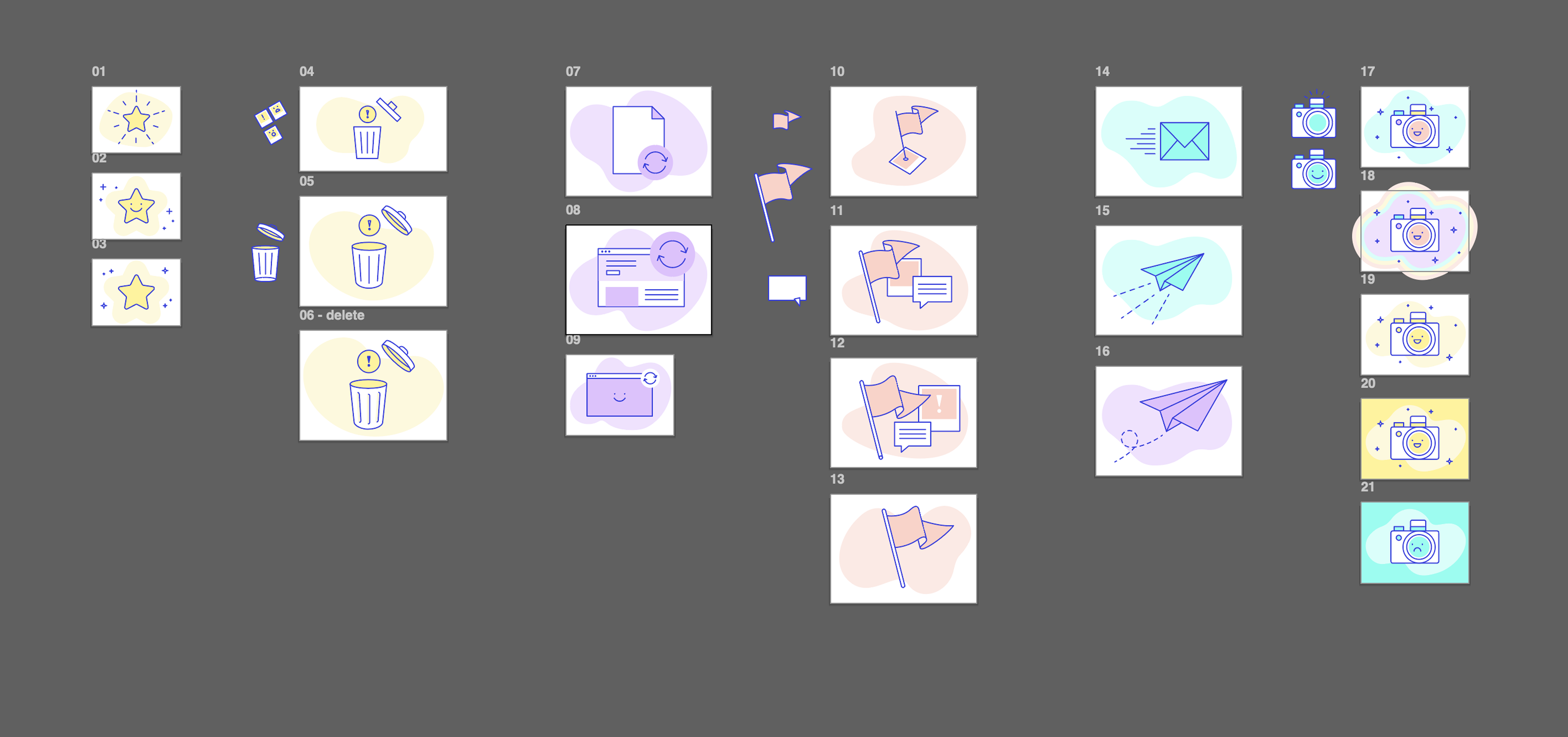
Selected explorations showing the development of individual illustrations and visual treatments.
Selected Works

CPH Show Art '13-17illustration, art direction, visual identity

New Ground Theatre Festivalprint campaign, visual identity

Welshly Armsalbum artwork, visual identity

CWRU/CPH MFA Acting Programposter design, visual identity, print campaign