
Visual identity and campaign design for Cleveland Play House’s annual new play festival.
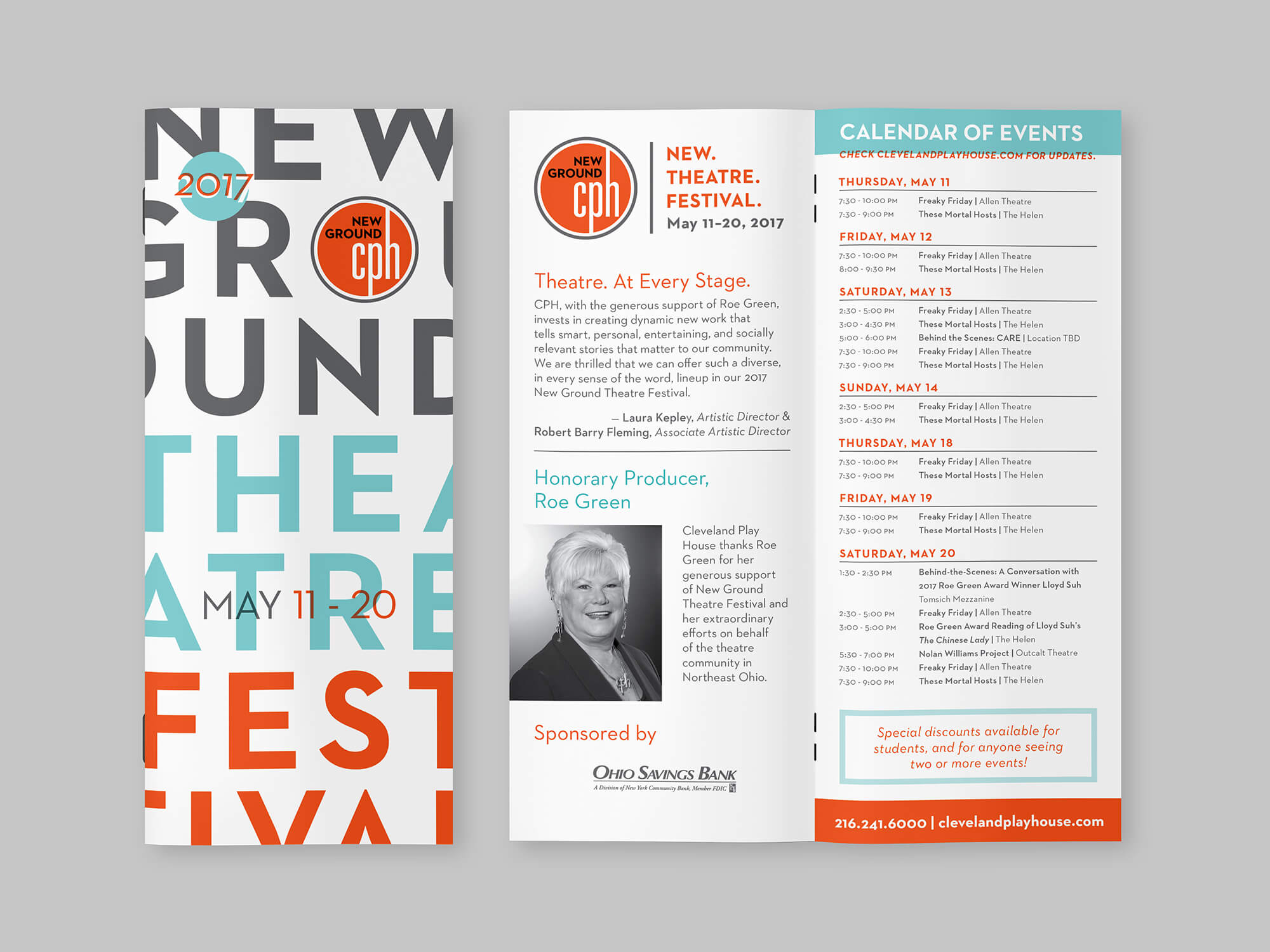
New Ground Theatre Festival
Challenge
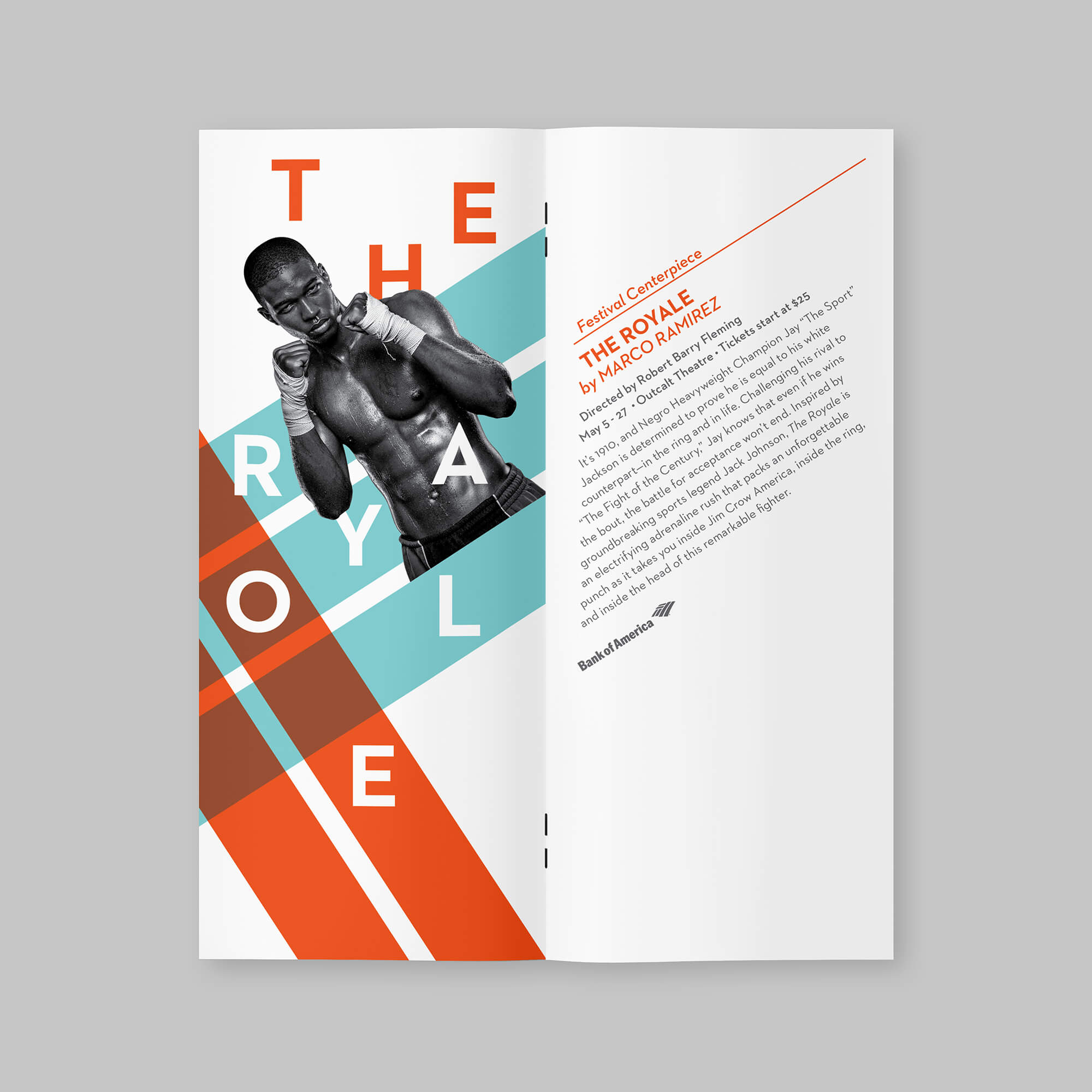
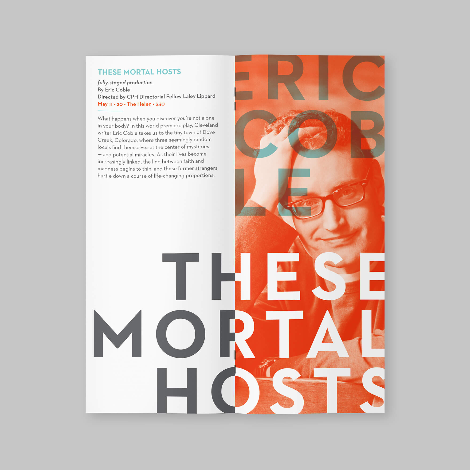
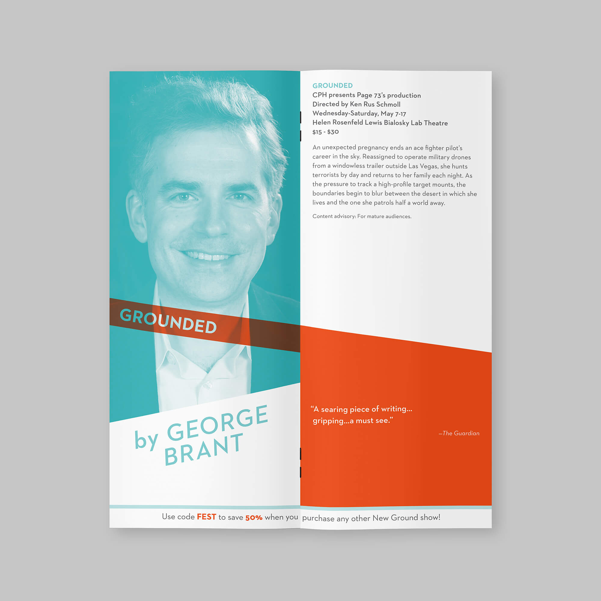
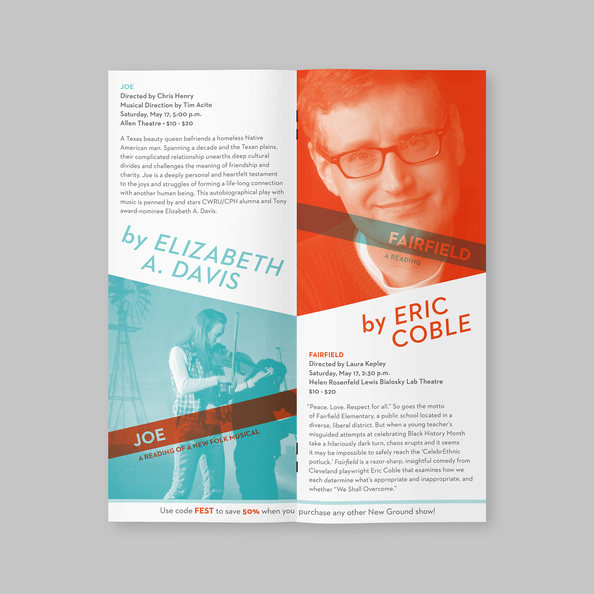
New Ground Theatre Festival is an annual showcase of new theatrical works at Cleveland Play House, featuring new work from nationally recognized artists and a centerpiece production each year.
The challenge was working with very limited assets—often just playwright headshots—while also navigating a low budget and quick turnaround. The work needed to feel intentional and cohesive despite these constraints. It also needed to feel distinct from year to year.
Approach
I re-branded Cleveland Play House’s New Ground Theatre Festival (NGTF) in 2013 and continued designing the festival’s collateral for four consecutive years.
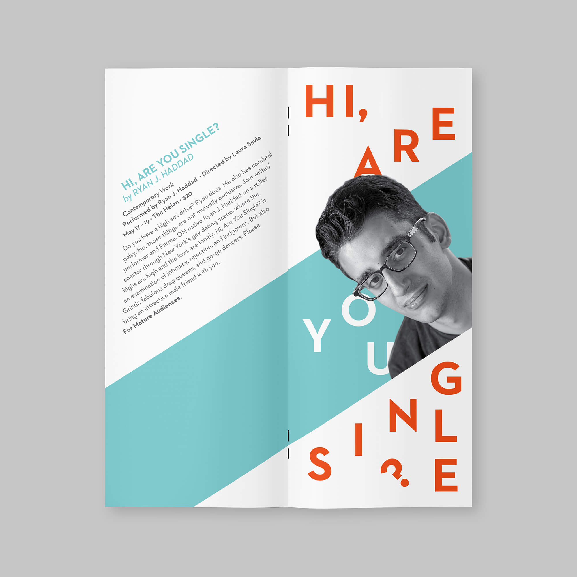
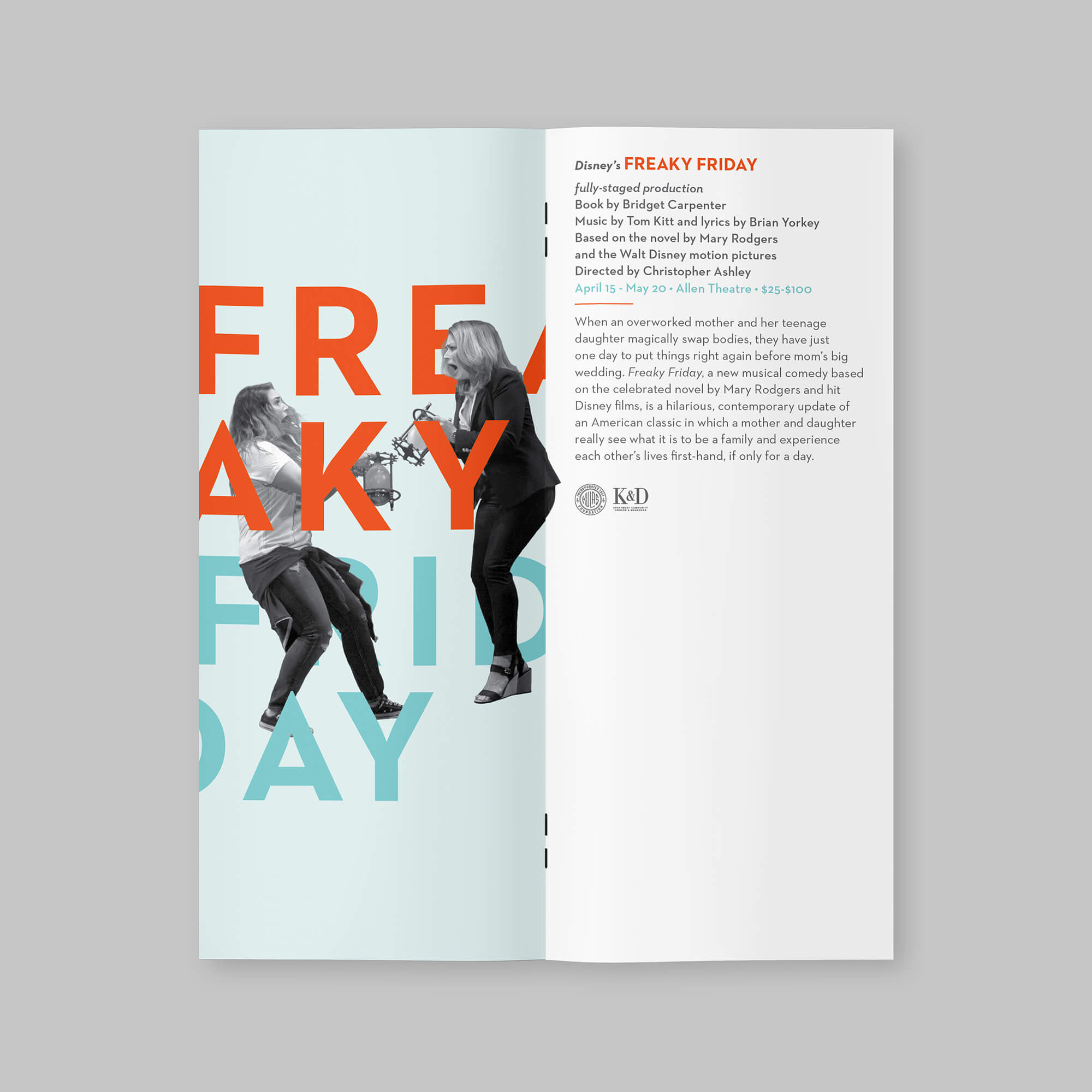
The visual direction was inspired by the existing logo’s shape and color palette, featuring circular forms and the clean, geometric Neutraface as the primary typeface. A pop of orange stands out against gray.
I paired the bold orange with a warm light blue, creating strong contrast while still feeling cohesive. The colors were often blended using multiply to add depth while keeping the palette simple.
Because the available assets were inconsistent, I converted most photography to black and white so it wouldn’t compete with the color system. When stronger images were available, I let those lead the composition.
Each year I would change the styling slightly and use different angles and shapes to keep each season from feeling repetitive.
Client
Cleveland Play HousE
Role
creative direction, visual identity, layout design, print design
Deliverables
brochures, posters, digital displays, postcards
2018


2017


2016


2015


2014


2013


Selected Works

CPH Show Art '13-17illustration, art direction, visual identity

Welshly Armsalbum artwork, visual identity

CWRU/CPH MFA Acting Programposter design, visual identity, print campaign